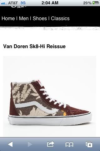
JesseC wrote:Vandol wrote:Those pirate eras looks pretty cool, the rest would look good if they didnt look "used"
To almost everyone that is the major appeal, along side the Van Doren name. I have the sample multi colored Era's and they look more vintage that way. The faded look draws the attention and then the closer look reveals that they're "Van Doren's". If they looked fresh, people would only recognize them as another Print Vans shoe.
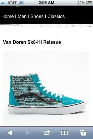
I think they should be recognized as a normal gr shoe at first glance, but having the different heel tab to cause some sort of
wonder. Making the "what's Van Doren?" face.
Just like how the vanosaurs and the "logo" eras were. Even though not GR, people didn't realize
what they had or missed out on once it was off the shelf.
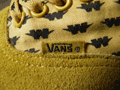
Im sure in person they look a little better but Id rather make the stone wash look by wearing them.
Also the gr pricing isn't bad either.